
Quite often you might want to change colours in a design to better suit the surroundings that they will be in e.g you have a grey and red living room, however your design is blue and purple. So, how do you choose which colours to change them to?
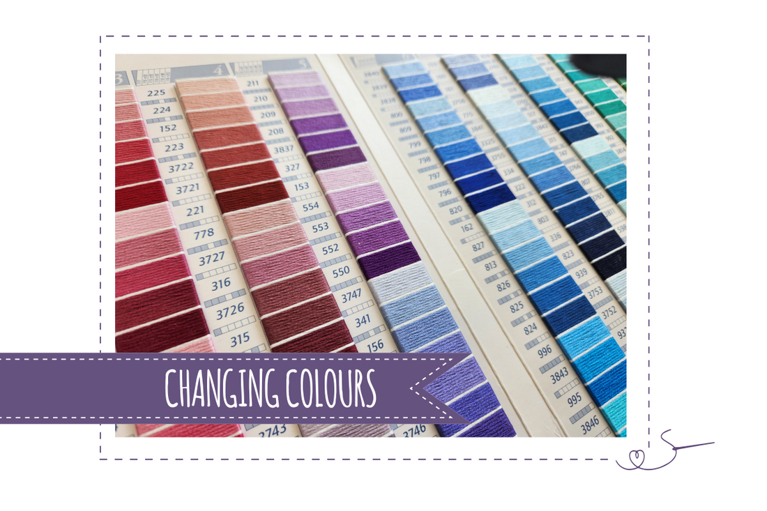
This process is much, much easier if you have either a good stash of colours, or one of the downloadable Colour Charts, or even better, a colour card which uses actual thread.
In an easy example, as mentioned above, with only two colours, that are different, e.g. Blue and purple to red and grey, you can easily change one for grey and one for red, but what happens when you have a design with two shades of blue?
In this case you will need to look at shades of blues; order the colours in the design from dark to light. Once you have 'ordered' the original colours, do the same with the reds in your stash, or have a look at the shades avaialble on the colour charts. You can then pick two colours which seem 'as far apart' shade wise as the original colours, and swap them in.
If you are completely changing the colours in a design, then things are a little trickier. I do not advise doing this with more than 5 colours as the designer will have chosen the colours for the best 'balance', and I also do not recommend changing the number of colours for the same reason.
But essentially the process is as follows:
- Have the Key of the original colours close to hand
- Have the colours to hand that you would like to use
- Order all of the colours in both sets from darkest to lightest
- Once you have ordered both sets, then swap the darkest from the design to the darkest from your stash/required colours, and repeat for all of them
CONSIDER YOUR MATERIAL
We are now getting into something called colour theory, and it's pretty complex, but it boils down to colours looking different on different backgrounds.
Looking at the image below - if you let your eyes focus on the smaller squares in the design you will see that the one the right is a lighter shade of purple...right? Wrong, they are the same shade/colour. The Background colour just makes them appear differently.

Just bear this in mind once you have your new colours, and, once you have your new set of colours, if you have material then your best bet is to hold them against each other and check that they give the effect you are after.
MATCHING COLOURS TO AN IMAGE
If you have an image you are trying to match eg. you have a painting in your room you want to complement, choose the same number of colours as used in the design from ones in the image eg/ the design has 5 colours then choose 5 colours from the reference image. Then follow the guide above.
STILL STRUGGLING?
I hope this has helped, but if you are still struggling then maybe have a look at the Colour Companions I have available (much as I would love to, I just do not have the time available to me to allow me to individually help with colour selections I'm afraid).
The Colour Companions give you 90 colour combinations (with references to DMC, Anchor, Sulky and Madeira threads) and shows them all on 4 different backgrounds.
